I love making complex products feel simple.
15+ years bringing clarity and usability to enterprise software, automation and e-commerce platforms, and global product ecosystems.
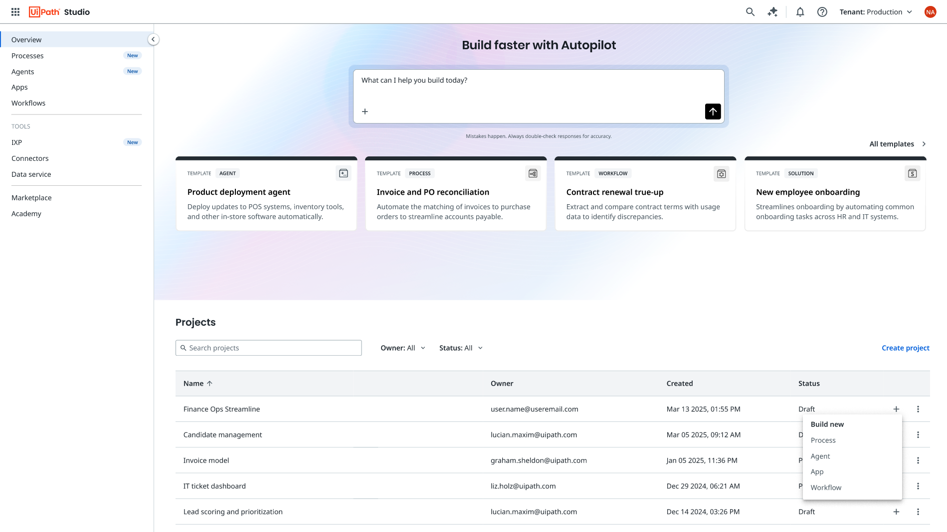
A unified product language
I gave a sprawling automation cloud one coherent vocabulary — from audit to journey map to a governed terminology system and streamlined navigation, then an AI assistant that scaled it.
Read case study →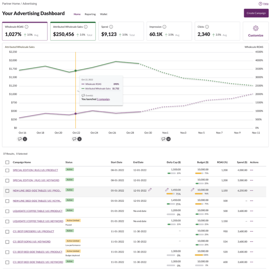
Unifying a seller advertising platform
Rebuilding Wayfair's fragmented advertising tools — its second-largest revenue source — into one experience sellers could actually trust.
Read case study →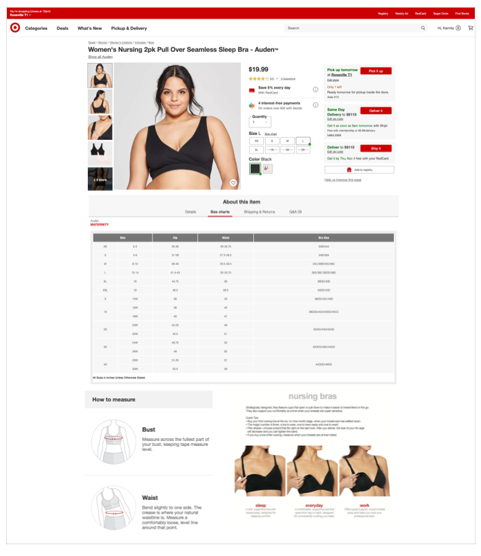
Closing a sizing gap that cost sales
From 10% sizing coverage to 80% in two weeks — doubling size-chart engagement and lifting conversion 6% on covered items. Then the model spread: imagery standards, fit education, and BabyCenter buying guides.
Read case study →
Sell on Wayfair marketing page
The page that recruits the marketplace. I defined the content with Supplier Marketing, wrote the positioning, copy & FAQ, and handed design a content-first wireframe — shipped globally.
Read case study →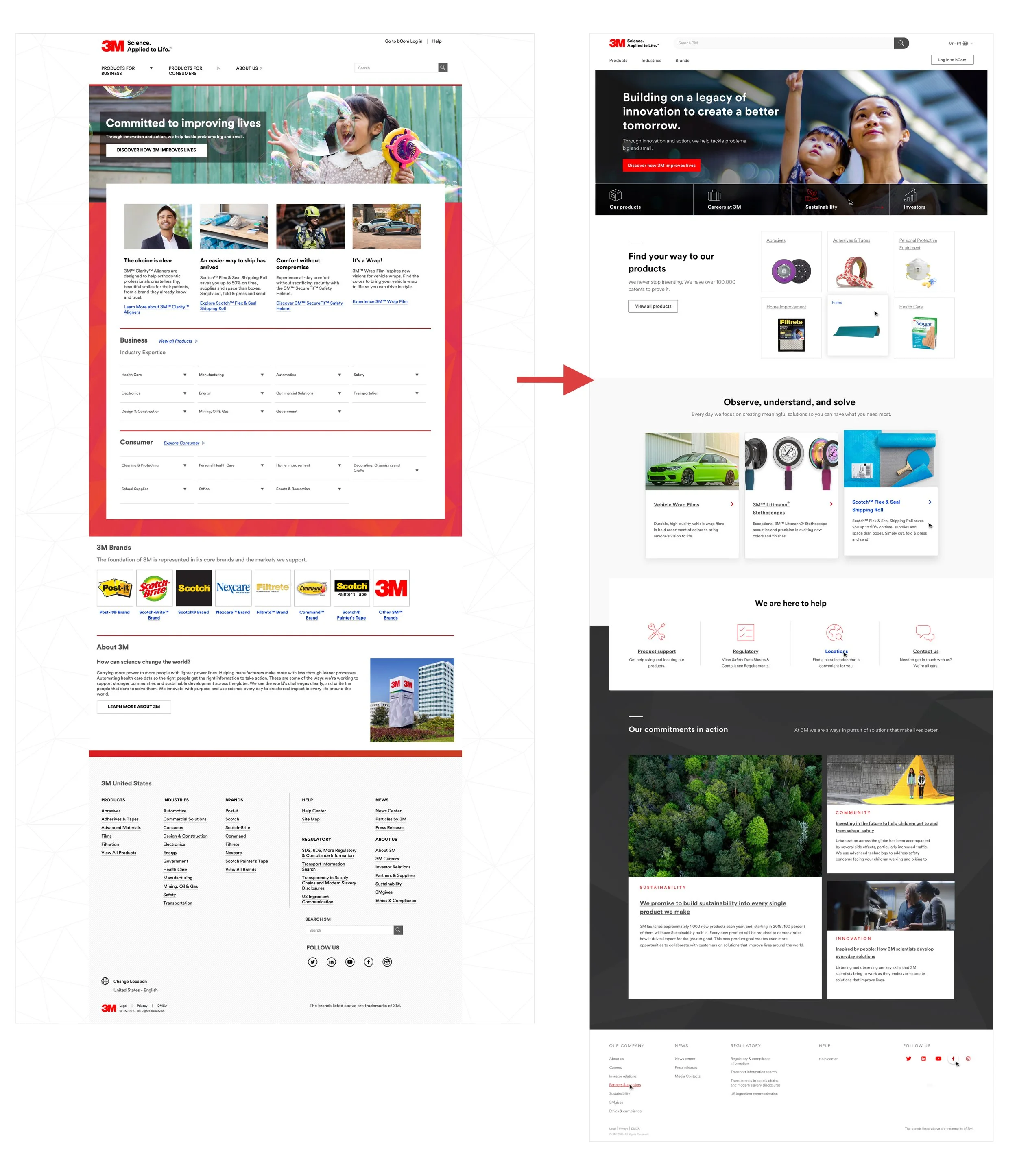
Rebuilding 3M.com's homepage
Benchmarking, workshops, and A/B tests to realign a dated homepage around real user needs — then a blueprint trained global teams to replicate.
Read case study →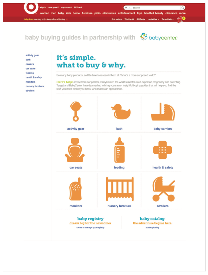
Baby buying guides
A nine-category system of co-branded buying guides and expert reviews that taught first-time parents what to buy and why. Drove 2.2–5.6% conversion.
Read case study →Kamila's insights and strategic recommendations change the course for projects and lead them to success. When she's on your team, listen to her — her design and user insights show you the way.Alex Pokorny — Digital Marketing & Analytics Leader