All work
3M — Case study

Rebuilding 3M.com's homepage around what users actually need.

3M.com's homepage was dated, off-brand, and — by users' own overwhelming feedback — a place they struggled to find what they came for. I believed realigning the page to real user needs would fix it. First, I had to prove it to a larger UX team and several business groups.

RoleUX Benchmarking · UX Design · Content Strategy
Scope3M.com homepage — research, design, and global rollout
DeliveredResearch · workshops · A/B-tested redesign · content blueprint
01 — The situation

A homepage is a hotel lobby, not a destination.

Most users don't linger on a homepage — they pass through it on the way to what they actually need. 3M.com's was dense, dated, and organized around the company rather than the visitor, so people couldn't get where they were going.

The fix wasn't a fresh coat of paint. It was understanding what users came to do, then restructuring the page — and the content — around those jobs.
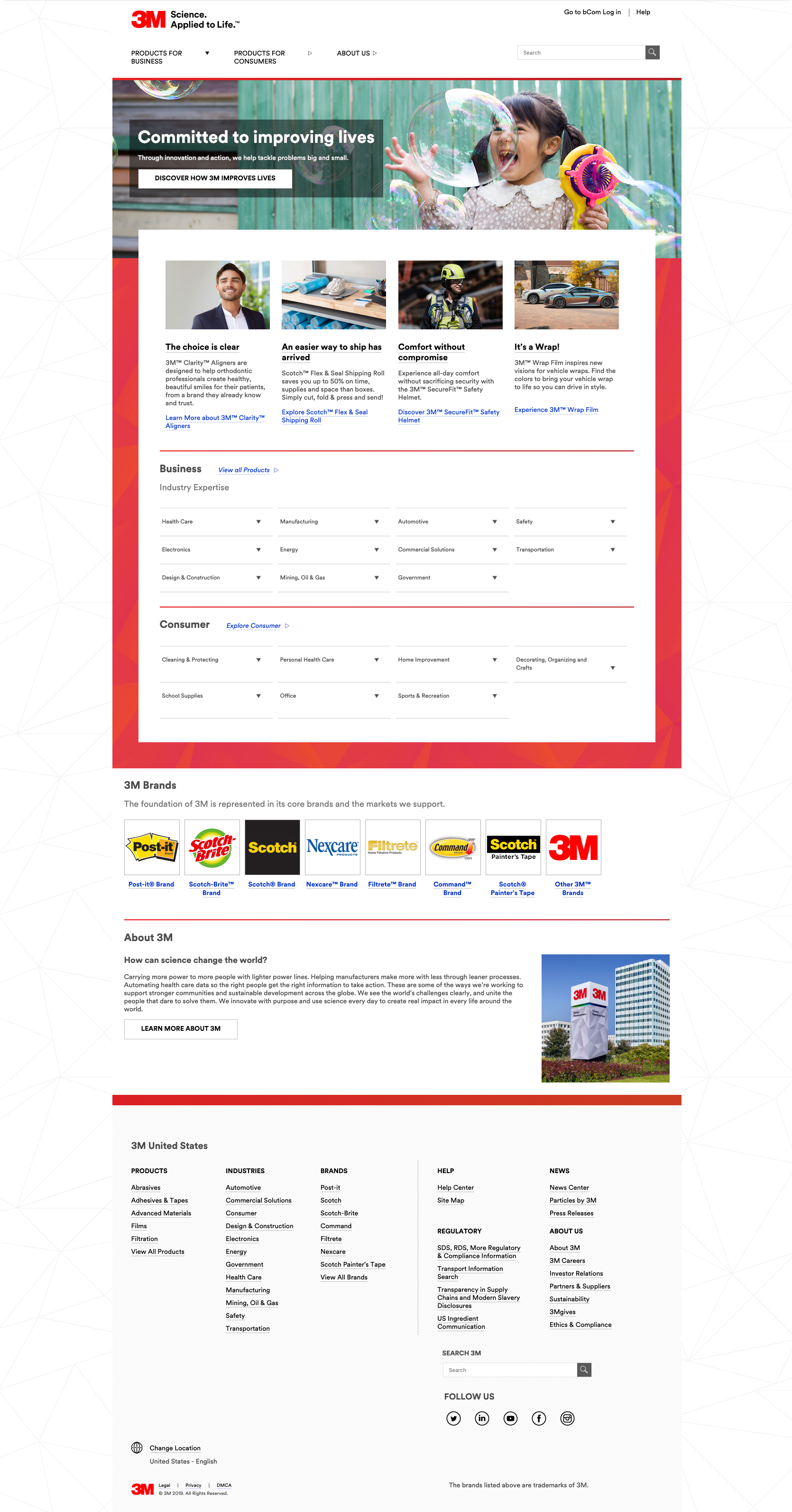

The old 3M.com homepage — a promotional hero followed by dense link directories organized by company structure
3M.com homepage — beforeOpen full page ↗
Before The homepage as it was — promotions up top, then walls of links organized by how 3M saw itself, not by what visitors came to do.
Homepage benchmarking research deck
Research Benchmarking, usability best practices, and a map of the gap between content on 3M.com and the content people were actually looking for.
02 — Build the case

Win the argument with evidence, not opinion.

To earn buy-in, I assembled the proof: I benchmarked 3M against other companies, gathered homepage best practices, and mined the Customer Support group for the real questions and pain points guests arrived with.

The research reframed the homepage's job — and gave a skeptical set of stakeholders a shared, factual starting point instead of competing opinions.

03 — Workshop the priorities

Turn user tasks into a content hierarchy.

I designed and ran empathy, prioritization, and design workshops that brought cross-functional partners together to brainstorm real user tasks and organize them into content themes.

That work converted a vague "make it better" into a clear, ranked set of jobs the homepage had to do — the backbone of the new design.
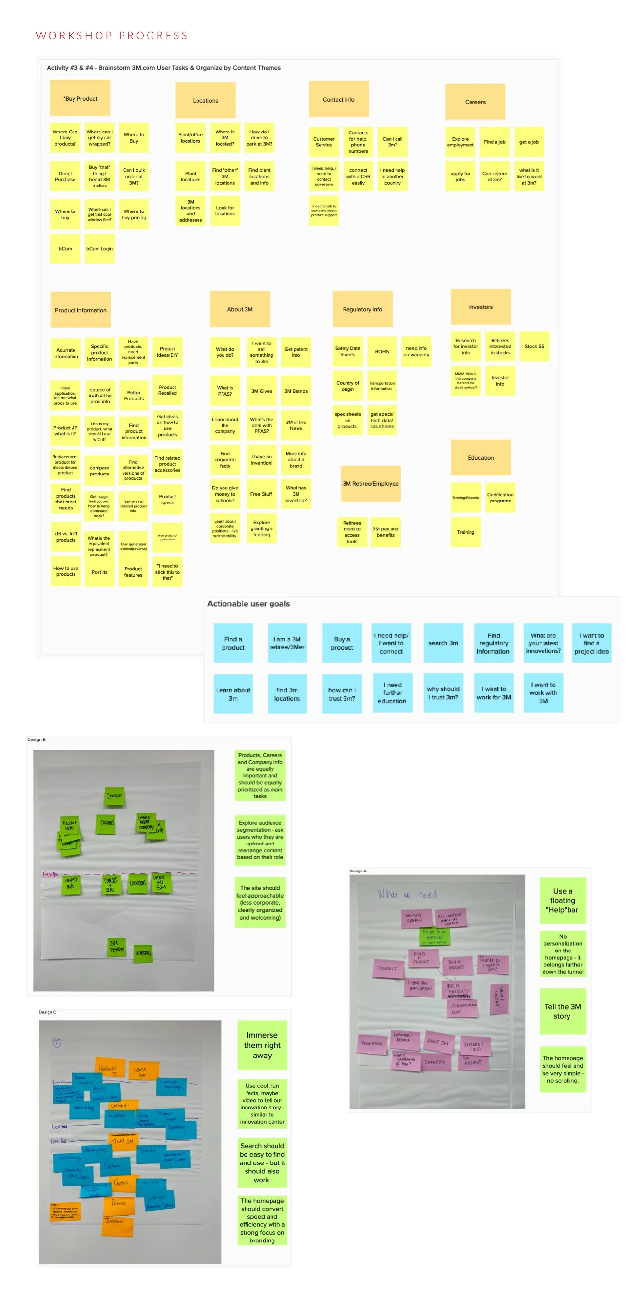
Workshop output organizing user tasks into content themes
Workshop User tasks brainstormed and clustered into themes, then distilled into actionable user goals and competing design directions.
04 — Design & validate

Draft, test, and let the data decide.

I drafted the wireframes, authored the copy, and partnered with a visual designer to bring it to life. Then we user-tested and A/B tested the concepts — down to questions as specific as icons versus images — so the final design was validated, not assumed.

The result was a homepage that situates visitors in a single glance and moves them toward what they need, quickly.
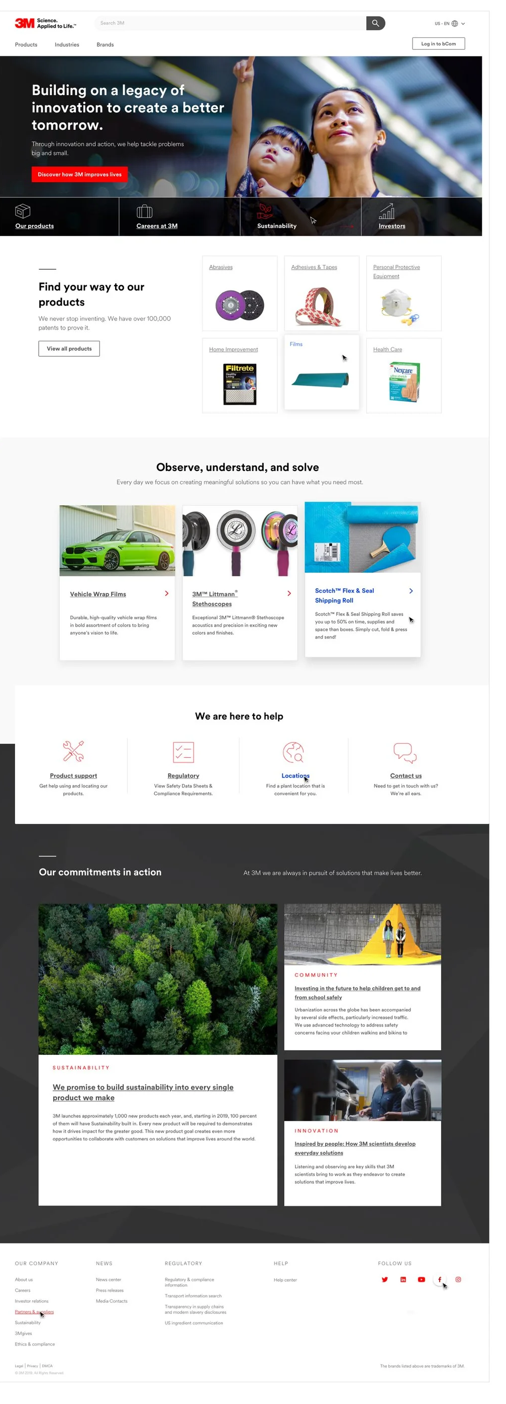
The redesigned 3M.com homepage — task-based hero shortcuts, product wayfinding, featured solutions, help, and commitments
After The redesigned homepage — visitors' top tasks in the hero, product wayfinding next, then help and the company story in supporting roles. Open full size ↗
05 — Make it repeatable

One redesign, a blueprint for the whole company.

A single great page isn't enough at 3M's scale. I turned the thinking into a content strategy and design blueprint, then trained global teams to apply the same approach — so the clarity could replicate across markets and sites worldwide.

That systems-level move — solving the instance, then designing the framework that scales it — is how I work everywhere.
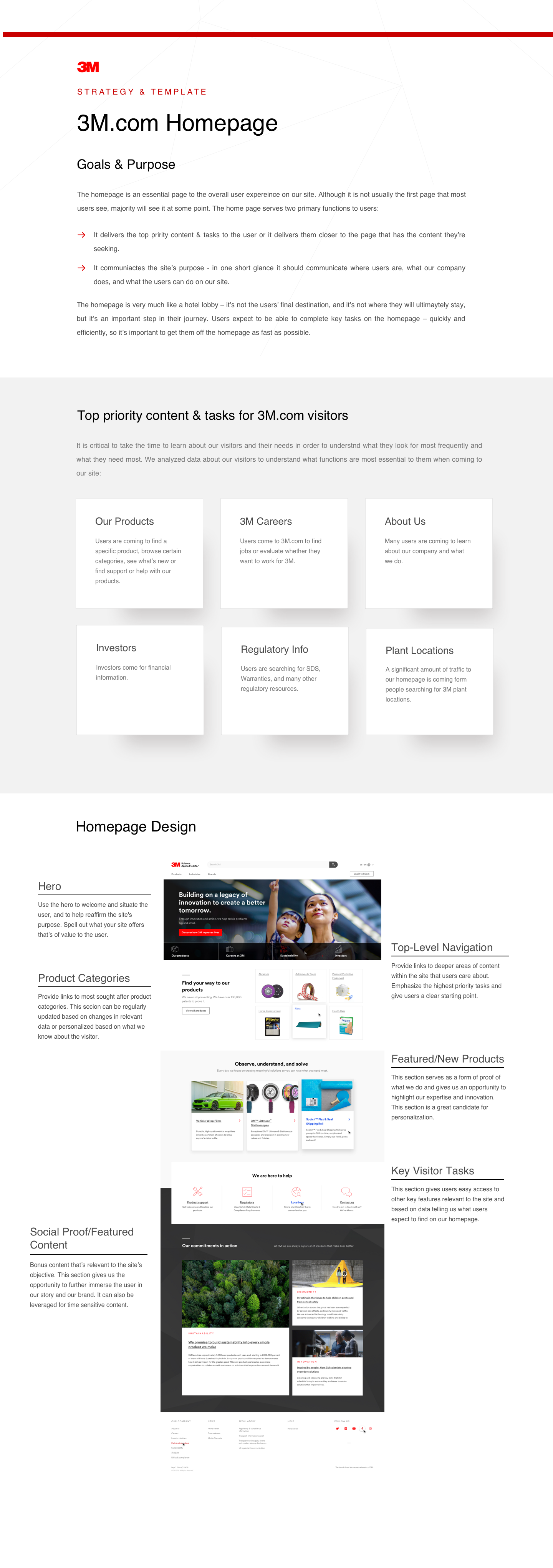
3M homepage content strategy and template blueprint
Blueprint The strategy & template doc: goals, priority content and tasks, and an annotated homepage other teams could follow.
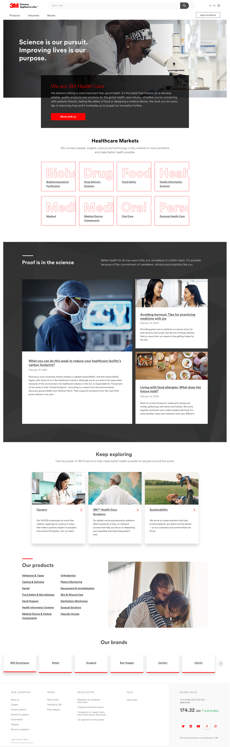
3M Health Care industry page built on the homepage blueprint — audience-first hero, healthcare market tiles, and task-based content
3M Health Care — industry pageOpen full page ↗
Replicated The blueprint traveling: the Health Care industry page built on the same structure — an audience-first promise, market-level wayfinding, then content mapped to visitors' tasks.