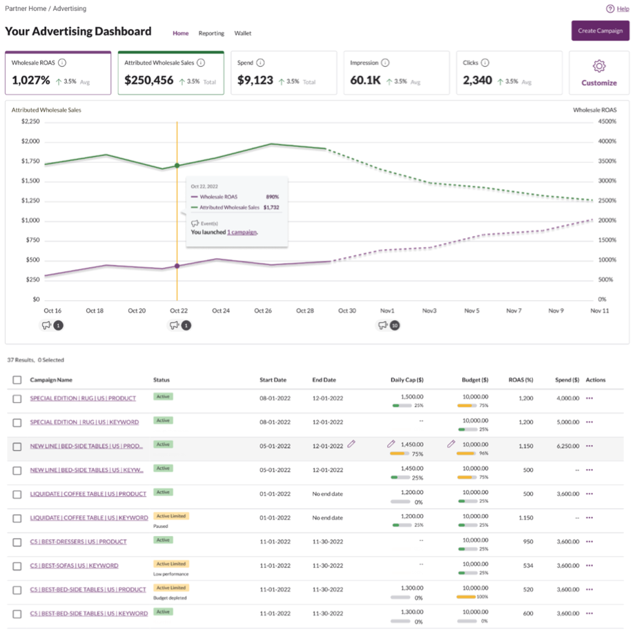
A revenue engine that frustrated the people it depended on.
Each part of the legacy platform had been designed as its own product. Sellers were handed a set of disconnected tools that didn't share navigation, language, or logic — and user feedback showed they were missing basic functionality sellers needed to succeed.
My team was given a clear mandate: rebuild the platform into one coherent experience. I led the content and information architecture end to end.
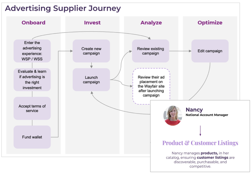
Start with how sellers actually advertise.
Before touching a screen, I mapped the advertising supplier journey — the full arc from onboarding into the program, to funding a wallet, to launching, analyzing, and optimizing campaigns.
Anchoring the work to a real persona and her decisions gave the whole team a shared model of who we were designing for, and where the experience was breaking down.
One dashboard, designed from the content out.
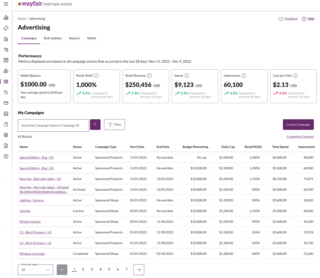
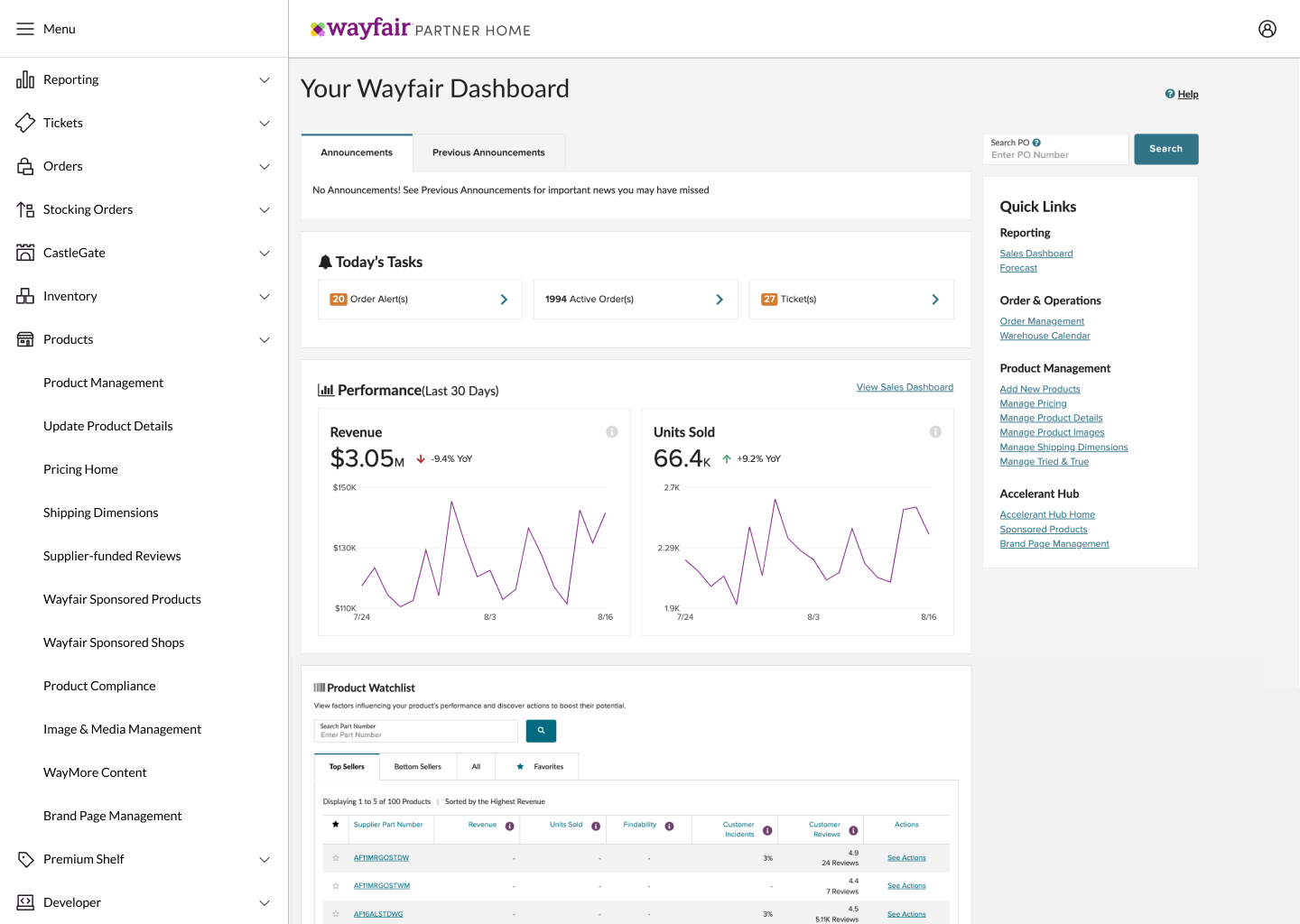
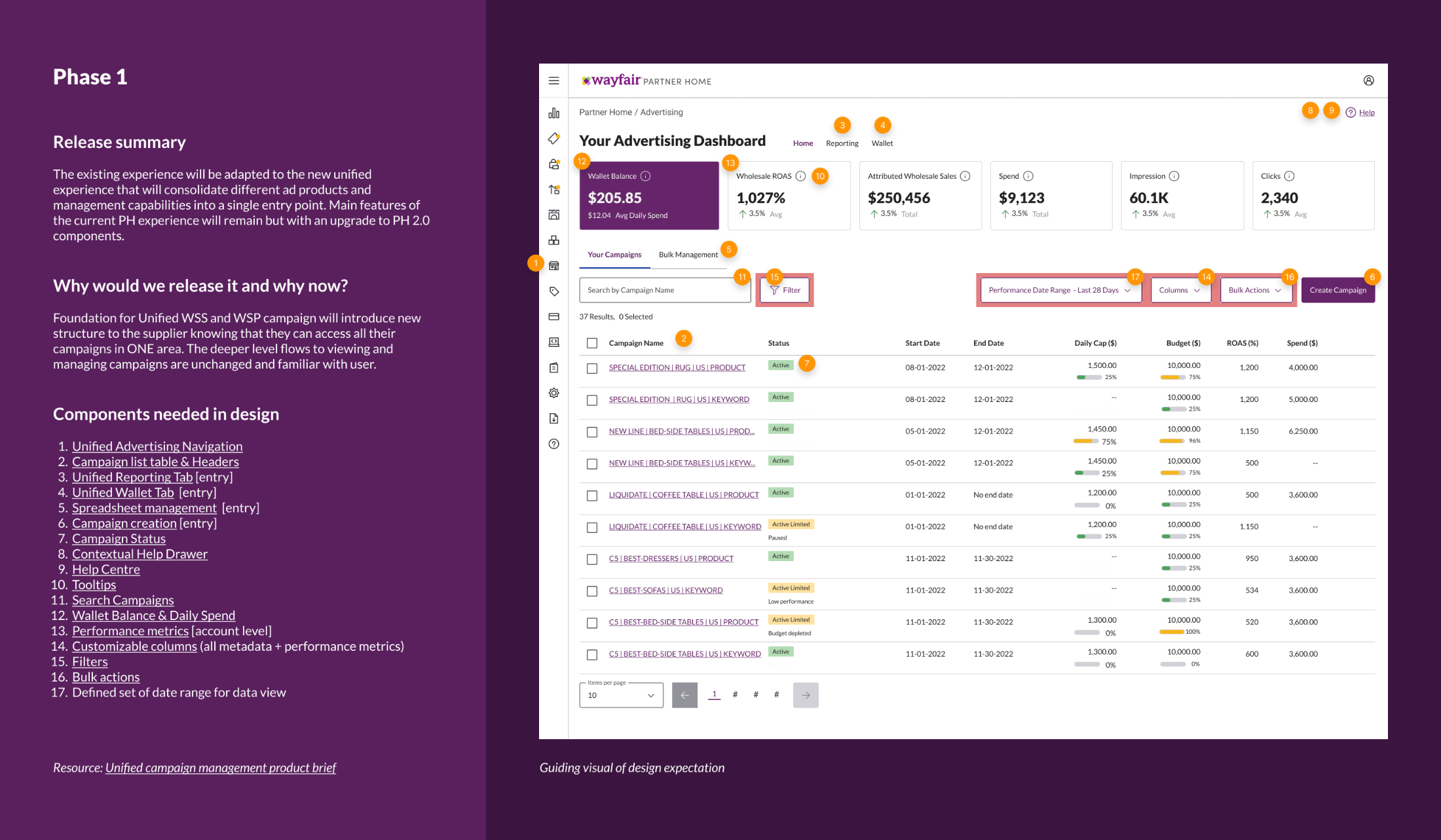
The legacy experience scattered spend, performance, and campaign management across separate tools — each with its own dashboard, its own language, and gaps where basic functionality should have been. I defined the information architecture for a single unified dashboard: what sellers needed to see first, how performance, spend, and campaigns should be grouped, and the language each piece would use.
I partnered closely with the Design Systems team to create the new components the unified experience required, so the IA could actually be built rather than compromised — evolving from a content wireframe into the annotated design the whole team built toward.
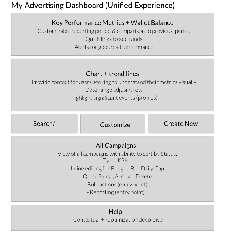
Every region defined by what it does for the seller.
It started as a wireframe. Before any visual design, I mapped the dashboard as content regions — each area defined by the job it did for the seller, not the widget that would fill it. This skeleton is what the unified design grew from.
When real money is on the line, words carry the weight.
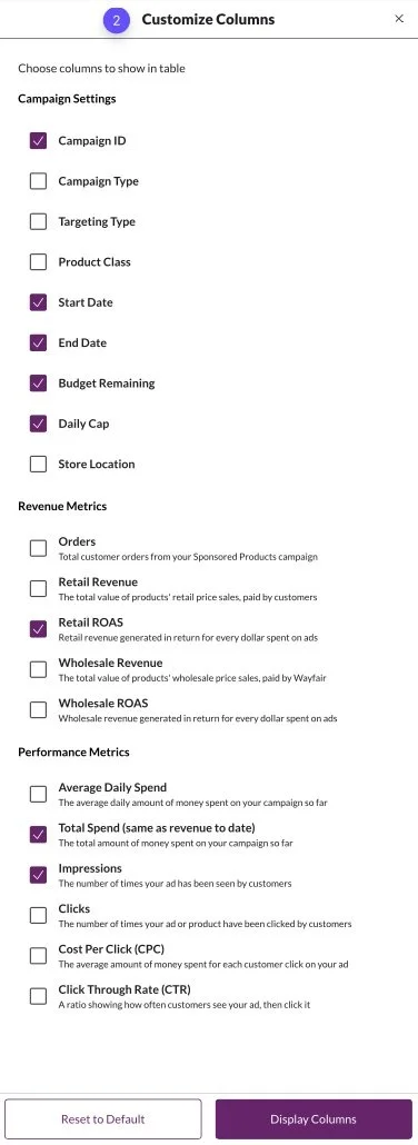
Sellers spend their own budget here, so the content had to earn their confidence. I wrote the tooltip and metric definitions that demystified ROAS, spend, and performance — the difference between a seller trusting the dashboard and second-guessing it.
I delivered ready-to-build wireframes complete with a new navigation strategy and the full library of supporting copy, so nothing was left to chance at build time.
Because the platform spanned the US, Canada, and Europe, I built the content to be localization-ready — consistent terminology, plus number, currency, and date formatting that would hold up across markets.
One platform that finally felt like one product.
The redesign replaced a patchwork of disconnected tools with a single, coherent dashboard — built on a shared journey, a clear IA, and content that helped sellers understand exactly what they were doing and what to do next.
It's commerce content at its highest stakes — the blend of financial clarity and trust that sellers need before they'll spend their own budget with confidence.