The product grew. The experience didn't grow with it.
UiPath's experience reflected its org chart more than the way customers understood their own work. Competing terminology, inconsistent navigation, different patterns for the same job — each product area designed as though it were the whole platform.
For anyone who wasn't an automation developer, that made for a steep climb. And the cost wasn't only usability: if customers couldn't understand how the pieces fit together, they couldn't get value from a significant enterprise investment.
Before redesigning anything, I needed to know whether these were isolated UX problems or symptoms of something structural.
Start by understanding the whole thing.
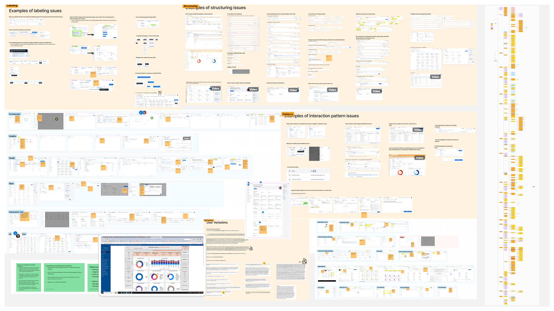
I audited the platform across 20 product areas — navigation, headers, terminology, UI patterns, empty states, documentation, and customer sentiment.
What I discovered
Fragmented UX
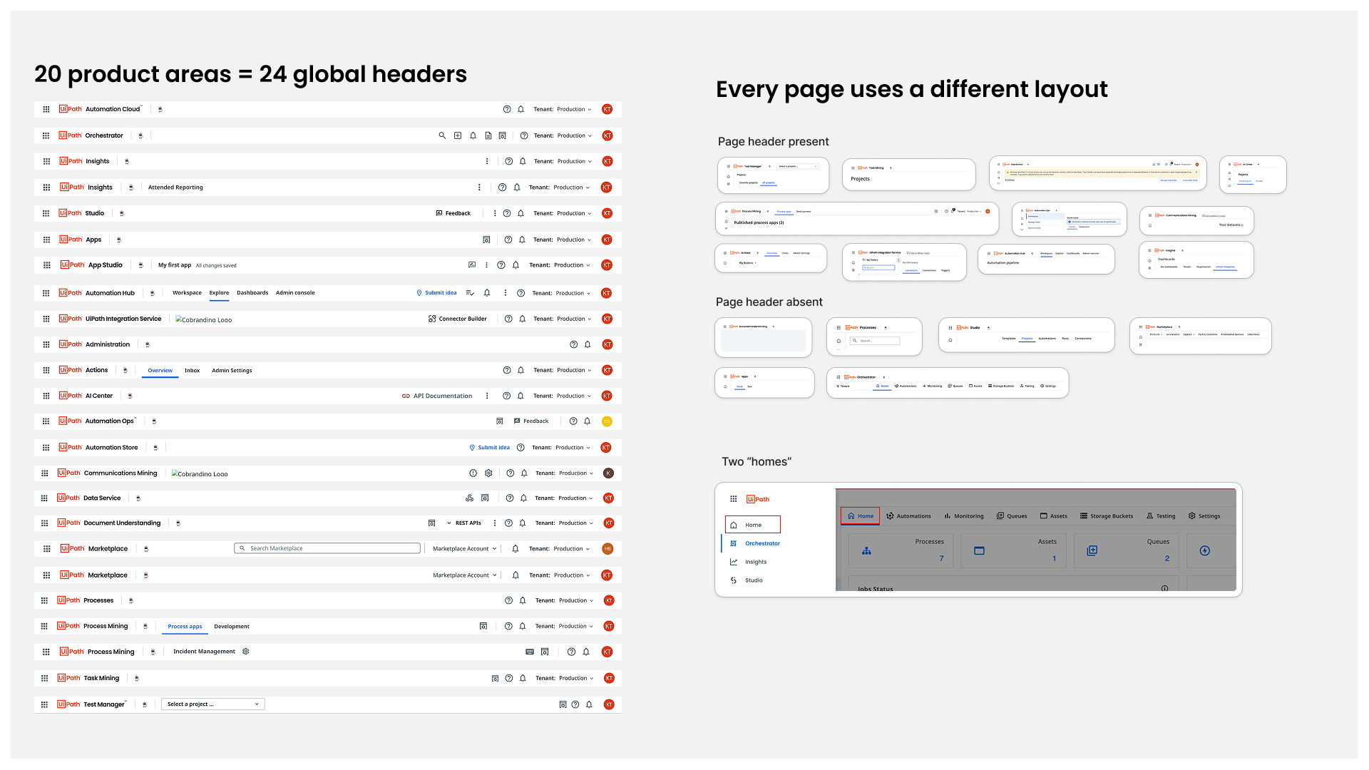
Pattern inconsistencies everywhere. Navigation, headers, empty states, dialogs, notifications — the same jobs solved differently in every product area.
No guidance where people needed it
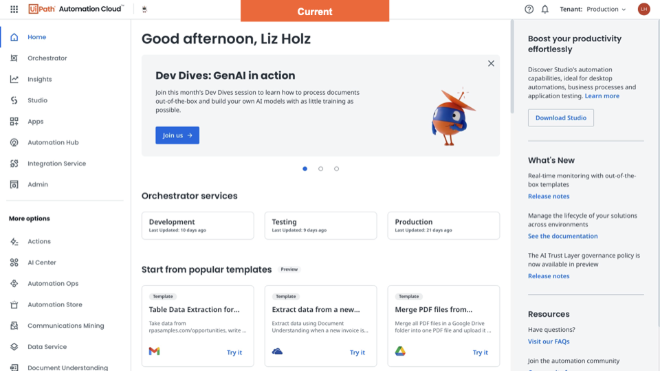
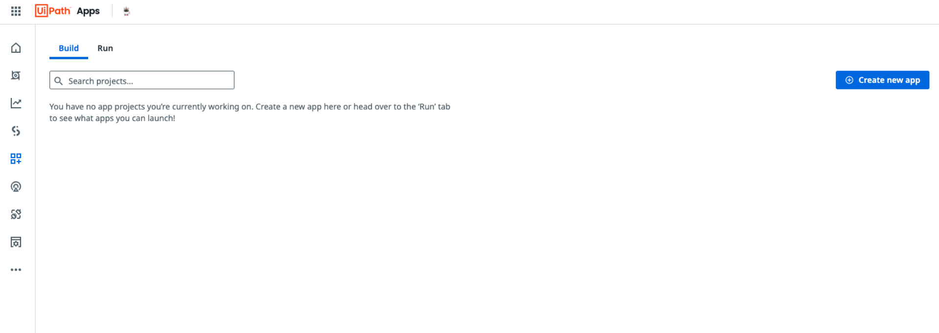
Key surfaces were either full of marketing copy or gave users nothing at all — no instructions, no cues, no path to a task, and no guidance for anyone who needed it.
Language all over the board
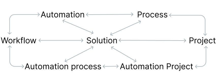
The core thing people came to UiPath to build went by seven different names across the platform — plus internal vocabulary customers had to learn before they could learn the product.
To get anything working with it, you need to be really into UiPath terminology — and still it just doesn't make sense.— UiPath customer
The interface problems were symptoms. We were missing the foundations — a shared model of the platform, and of the people using it.
We knew the roles. We didn't know the people.
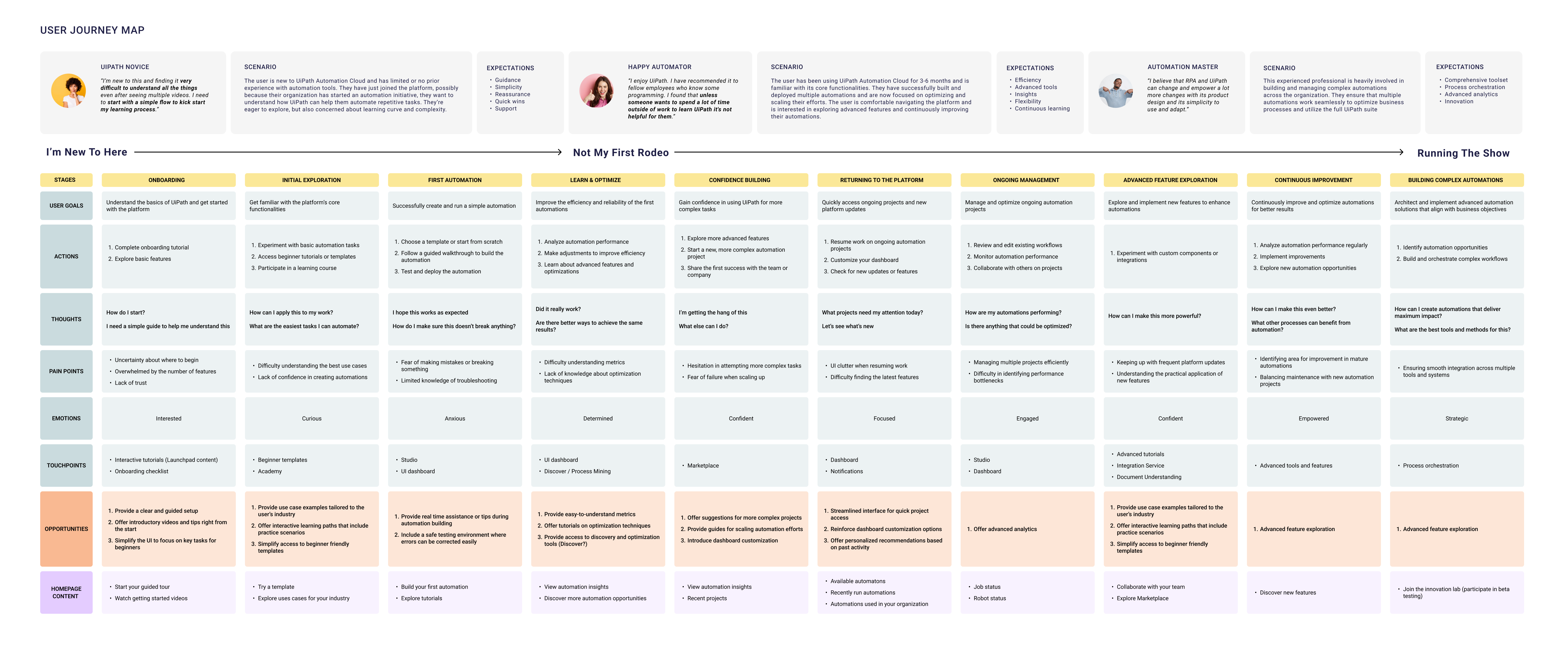
We had a basic sense of who was out there — developers, business users — but nothing beyond the label: no understanding of how each one actually used the platform, what their sentiment was, or where they struggled.
So I built UiPath's first end-to-end journey and sentiment map, and developed mental models so teams could design around a customer's progression instead of their own product boundary.
You can't name a thing you haven't defined.
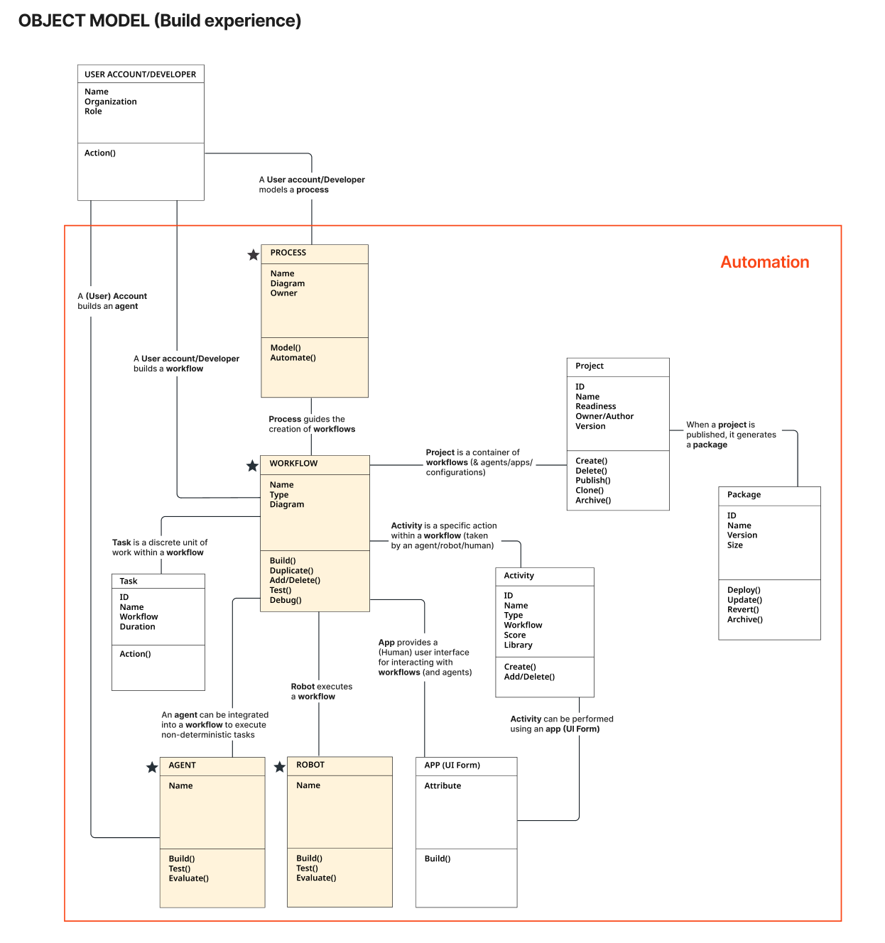
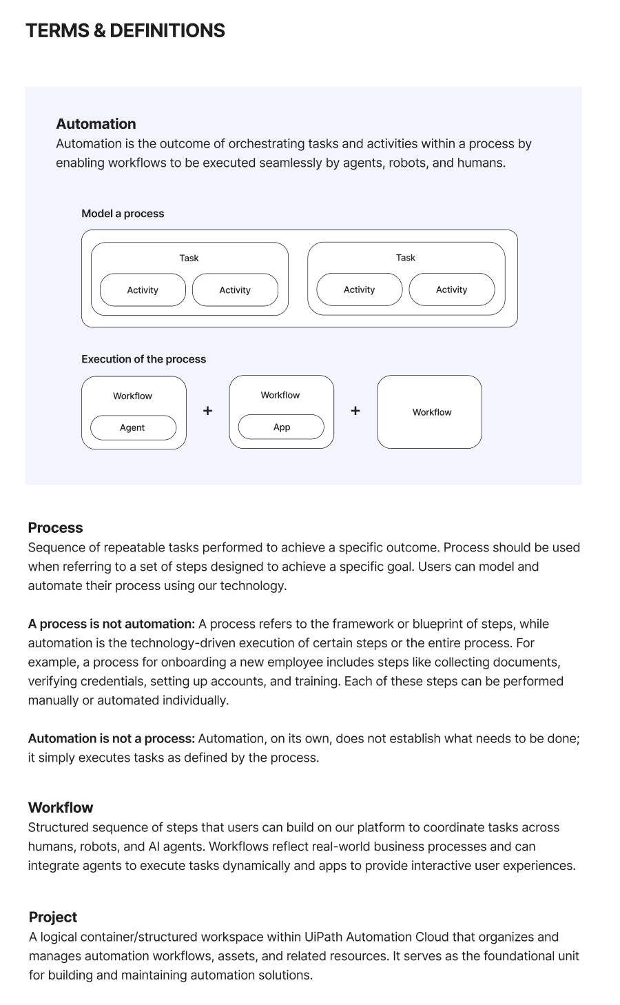
The reason we couldn't agree on language was simpler than language: we hadn't agreed on what the things were. I worked across teams to define the core objects, their attributes, the actions people take on them, how they relate — and from that, canonical names.
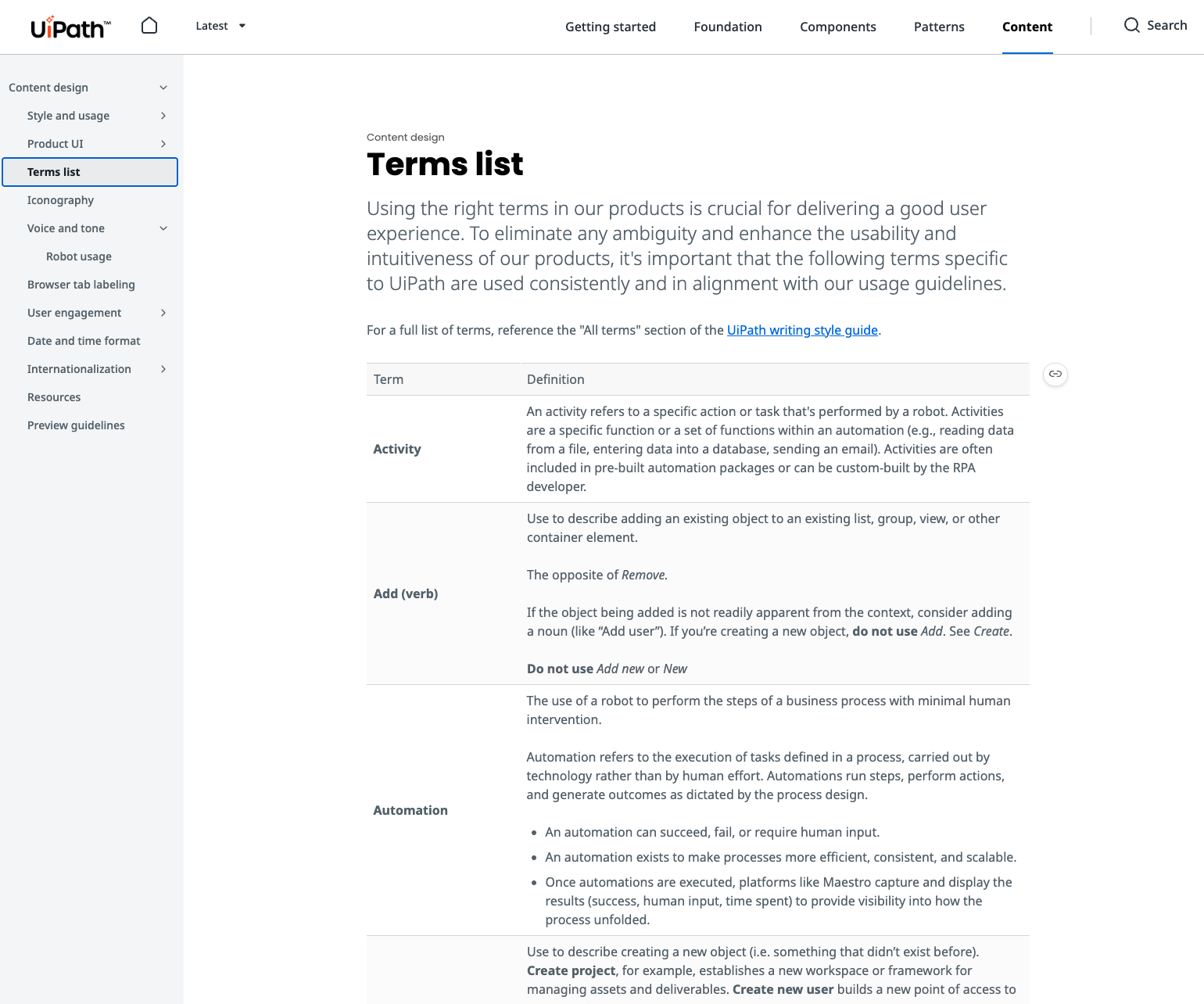
It answered two questions once, for everyone: what are the things in this ecosystem, and what do we call them? That's also what made a terminology glossary and its governance possible.
The system the platform never had.
With a model of the customer and a model of the product in place, the next gap was somewhere to put the answers — so teams weren't re-deciding the same things screen by screen.
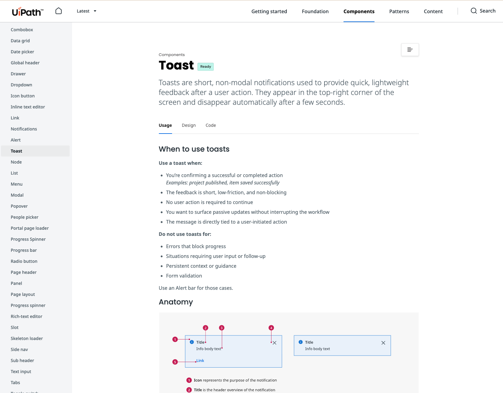
So I stood up a content design system that hadn't existed before: canonical terminology, voice and tone, style and usage, and the content rules for every product surface. Then I partnered with a product designer to overhaul the pattern side of the system too — working through it component by component, defining not just how each one looks but when to use it, when not to, and what it should say.
Then we put the foundations to work.
They shaped work across the platform. A few examples of what that looked like:
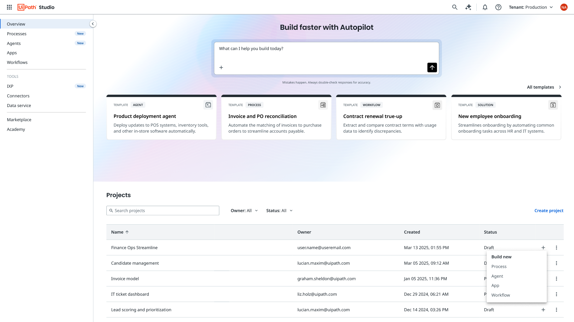
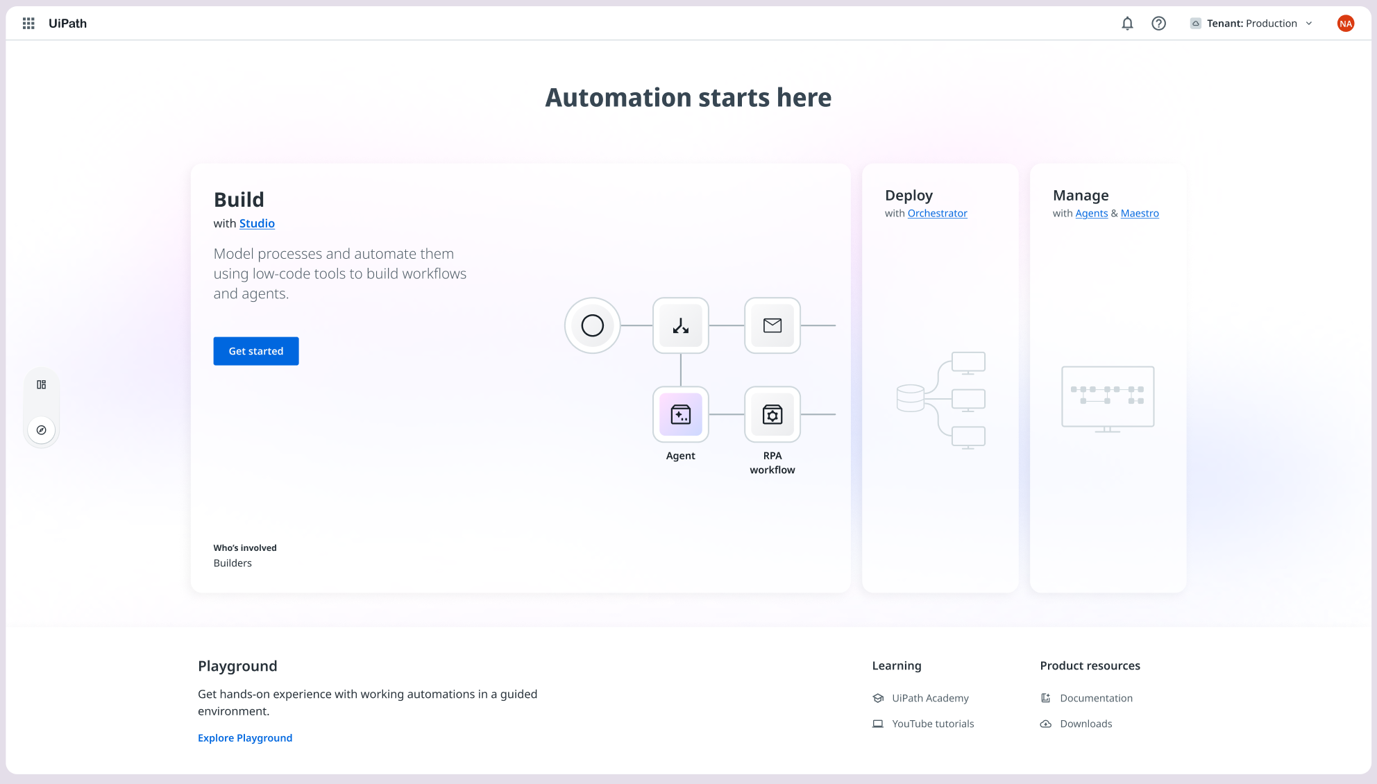
A homepage that answers "what should I do next?"
The old home led with promotions and a long ungrouped sidebar — it told you what UiPath wanted to say, not what you'd come to do. I created the content architecture and co-led the redesign with a product designer, deciding what belongs on the page based on what someone came to accomplish, what they were already working on, and how much guidance they needed.
The same question was waiting on every landing page in the platform, so the architecture became templates other teams could apply to their own areas.
Teach enough to take the next step. Not the whole platform.
New business users didn't know where to begin, what they could accomplish, or which concepts they could safely ignore for now. Using the journey and the object model, I led content strategy for a continuous onboarding framework — built to move someone toward value rather than teach them everything at once.
Read the full onboarding case study →
A standard nobody can reach is just a document.
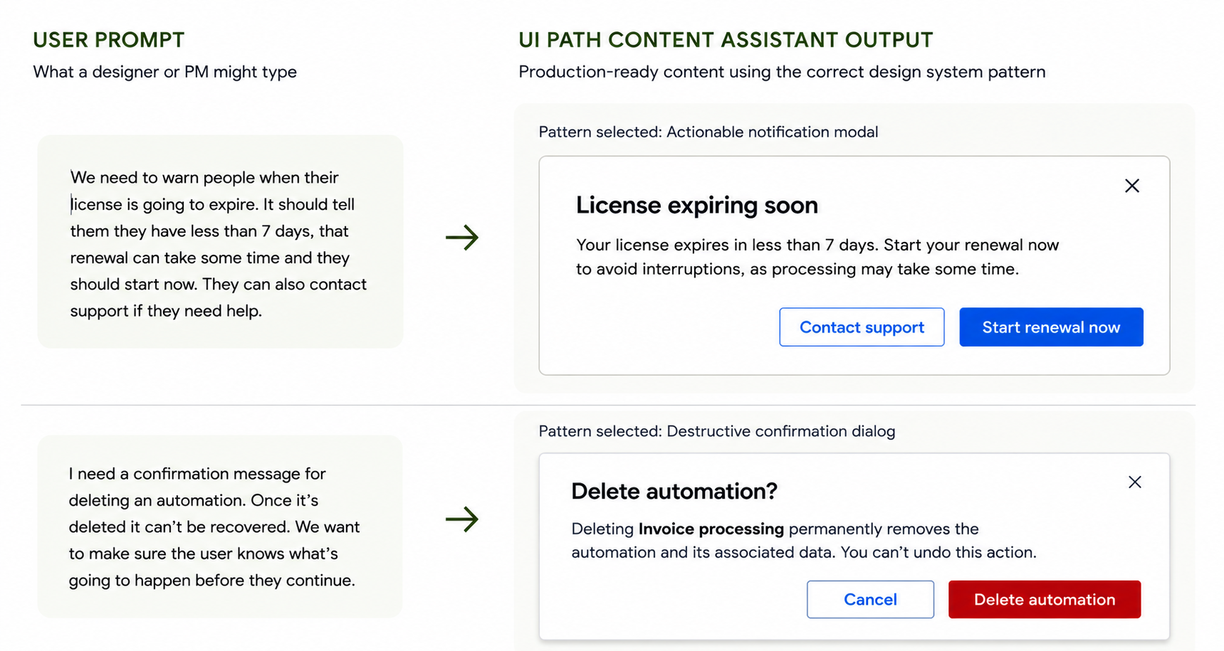
Once the system existed, the remaining problem was making it available to teams within their workflow. I built and trained a ChatGPT-based Content Assistant grounded in what we'd already established — the approved terminology, our voice, content standards, decision rules and design patterns — so designers and PMs could draft and pressure-test UI content without hunting through documentation.